Learn how to add charts, graphs to an infographic layout in Adobe InDesign
- Angelo Montilla

- Apr 19, 2020
- 3 min read
Updated: Dec 2, 2025

Infographics can bring life to an editorial design, brochure or company annual report.
Much like a photograph is a supporting asset to a profile or story, infographics also serve an important purpose. They convey additional stats and figures as well as other key information as part of a brand's message or story.
In this tutorial, I will go over five ways to design and add simple charts, graphs, figures to your Adobe InDesign infographic layouts.
In this particular example, I have compiled information about climate change and used it to put together a simple infographic layout.
Let's start with how to create a pie graph in Adobe Illustrator.
Pie Graph
In Ai, click and hold the Column Graph Tool and work your way down to the Pie Graph Tool
Hover over your artboard, and drag out the size you want pie chart to be. This can be resized after the fact, too.
Once the chart is applied to a page, a data window with rows and cells will appear to add figures to the graph. In this tutorial, I created one with two fields — 25% and 75%.
Once the figures are inserted, click the check mark to apply and close the window. (Tip: Before moving forward, create another copy of this graph and move it off to the pasteboard - you may need to pull another version if doing multiple graphs.)
With the selection tool, click the pie graph and go to Object > Ungroup. This will allow you to apply different formatting to the graph. Just be sure to have the figures set beforehand as it is now an uneditable graph in terms of changing the figures.
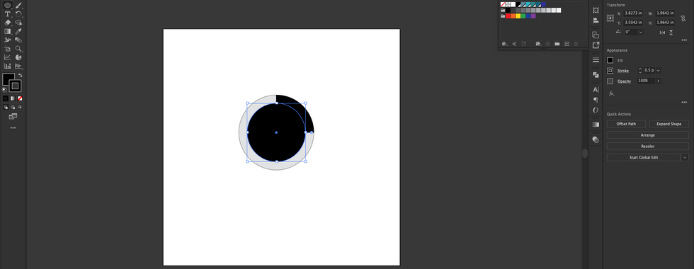
Go to the Ellipse Tool and make your way to the centre of the pie graph. Hold Shift + Option and drag out an Ellipse shape, leaving about an inch or so of the graph visible.
With Selection Tool, drag and select the graph and the shape together and the click on the Shape Builder Tool.
While holding Option on a Mac, Alt in Windows, click and remove the inner part of the circle, creating a hole in the graph.


Great job! You created a pie graph in Illustrator. Now, it's as easy as copying the graph and pasting it into a InDesign layout. The cool thing is it carries over as a vector object, allowing you to change the colours of each pie shape.
Let's move on to the Line Graph, which has the same method, but there are some key differences when creating this type of chart. We'll be creating four different lines within the graph.
Line Graph
Make your way back to the Pie Graph Tool, hold down for the flyout and select the Line Graph Tool
Hover over your artboard, and drag out the size you want pie chart to be. This can be resized after the fact, too.
Once the chart is applied to a page, a data window with rows and cells will appear to add figures to the graph. In this tutorial, I created one with four lines within the chart. Refer to the video or slide to get the numbers, if you want it to look identical to the one in this example. Otherwise, just make up the figures.
Once you have inserted the figures, click the check mark and close the data window.
Use the Direct Selection Tool to click on the line segments within the graph to format and change colours.


While there are bar graph options in Ai, in this example, I am going to go over another way to build your own bar graph chart in InDesign.
Here's how:
Bar Graph
Click on the Rectangle Frame Tool, draw out a long rectangle shape with a depth of about 0.2"
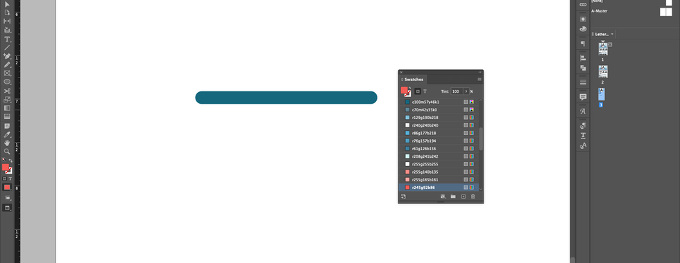
Apply a fill colour to the shape
Click on the shape with the Selection Tool.
Now, click on the Yellow square icon (it's pretty small, but you can zoom in if you have to) with the Selection Tool. It will be located under the upper top right-hand handle on the frame.
With all four Yellow handles now lit up, pull any one of the four inwards to create rounded corners.
With the shape still selected, go to Edit > Paste in Place. This will place the same shape on top of the original.
Click on the shape on the top with the Selection Tool and drag the right handle left and adjust to your requirement.
Click on the original shape with the Selection Tool and change the colour to Black with a 30% Tint.
Create as many copies of the bars as you need and always adjust the the top shape version to create a bar graph.